Painting with Light
Coloring Outside the Lines

By now, most of us have been able to re-explore the outside world. We visually are able to see more than the inside of our homes and interact with people outside of our “shell of a world,” on a regular basis. Visual interest is back in our minds, other than a grocery aisle stocked of Lysol or paper products.
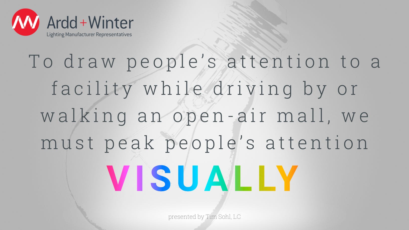
To draw people’s attention to a facility while driving by or walking an open-air mall, we must peak people’s attention visually. Now more than ever, we see the desire and urge to make a storefront, façade or interior of a store “draw” people in. Hence the need to bring color into a space by utilizing color changing LED lighting.
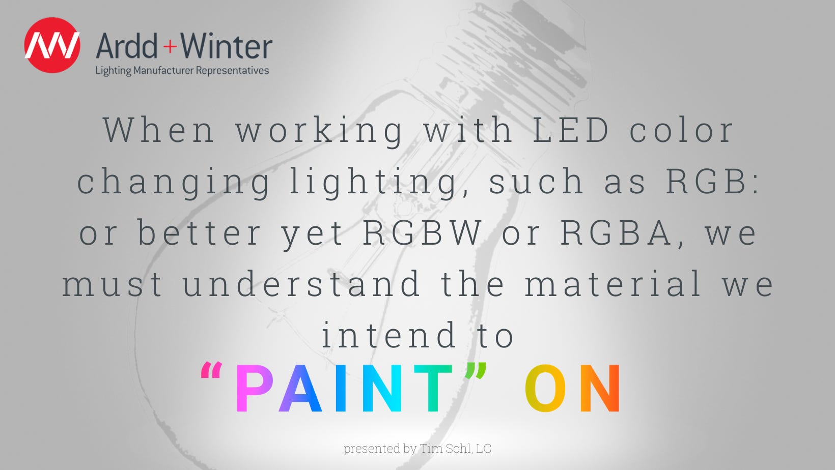
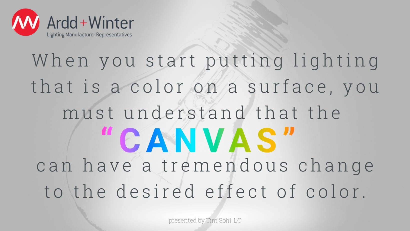
When working with LED color changing lighting, such as RGB: or better yet RGBW or RGBA, we must understand the material we intend to “paint” on. Think of the material a painter starts with; many times, it is a simple neutral white canvas; so those colors he or she selects will still appear to be those colors as they are. However, when you start putting lighting that is a color on a surface, you must understand that the “canvas” can have a tremendous change to the desired effect of color. As we mix primary colors, we can see changes to how the light appears. For example, a red toned brick wall with a heavy saturation of blue LED light, may give off a greener appearance than what is expected. This further can be affected by the kelvin color of other lighting in the area (pole lighting, etc). With these factors overlooked many times, it becomes critical to be able to change like a “chameleon” to blend or even pop in contrast to the substrate we are “painting” on by way of LED lighting.
This brings me to the point that when designing with color changing light, we should gravitate to a minimum of four channel LED color changing lighting. RGBW or RGBA have found a more solid home for “painting with light,” and allows ultimate flexibility to truly “tune in” saturations and allow for the designers true intended colors to show themselves. The RGBW will bring more benefit when trying to accomplish “cooler” pastel colors while the RGBA has more of an accent into rich color tone saturations (gold, yellow, orange). It is always recommended that a simple mock-up be done using the finishes that the final product will be placed on. A simple demo of a fixture in an office conference room is not the same results as going outside at night on a wall that is textured red brick.
Ardd + Winter is always ready and able to help accomplish the desired effects a designer envisions. With the manufacturers Ardd + Winter represents such as Luminii, Cooper/Ephesus, Acclaim, and many others, we can help accomplish the desired effect. We are here to help and look forward to bringing color into your design.
Timothy Sohl, LC
Principal / Vice President